
Scientists have learned more about how our brains work in the last two decades than in all of previously recorded history. We can now measure and quantify how our subconscious minds influence our choices and react to imagery, whether it’s a web-page, product packaging, a logo or a poster. These insights can be applied to helping designers, marketers or anyone else who creates images for work or the web.
‘Neuro Design’ is a new field that applies research findings from the mind sciences (such as psychology and neuroscience) to understanding how we respond to designs and visuals of all kinds. There are many Neuro Design principles that have come from this new wave of mind-science research. Here are three examples that you can use to make your designs more appealing to your customers’ brains.
Grab attention by harnessing science of the subconscious
Our eyes can only see a relatively small area in detail at any one moment. We’re largely unaware of this because our eyes jump around quickly and our brain ‘fills in the gaps’ so that we’re consciously able to experience a complete visual scene.
However, one interesting consequence of this way our visual system works, is that our brain needs a super-fast, automatic way of telling our eyes where to focus first. If you walk into a room that you’ve never been in before, for example, you have no idea what you will see in the room. How do your eyes know where to focus first? It’s not until you focus, and see detail, that you can even be sure of what exactly is in front of you.
The answer, is that our brains run a sort of small software algorithm that neuroscientists call a saliency map. This is a calculation that our brains make just on the raw information that is incoming from our eyes: the colours, contrasts and patterns. Crucially, this is happening before our minds even understand exactly what the objects are. As it happens quickly, and isn’t based on the meaning of what we’re looking at (because it’s happening before we’ve figured out what it is we’re looking at), the things that grab our attention quickly in this way tend to be the same across people, irrespective of age, background or culture.
Essentially, the more that something is different from the other things around it, the more likely we are to look at it first. This is different from just choosing something bright or a bold colour in order to draw attention to it. The key thing is that the element you want people to see quickly – such as a package design on a shop shelf, or an important link or button on a web-page – needs to have contrast with the other things around it. Using a contrasting colour, well-defined edges and large blocks of colour (without too much gradations of colour – which damage contrast), will help a design element get noticed quickly. Of course, on one level this may sound like common sense, but it is a principle that is often overlooked. It’s also surprisingly effective. If people, for example, are looking at a display of products, the product their eyes are drawn to first is far more likely to be selected, even if it usually wouldn’t have been their first choice.
Understand how to compose images to make them more engaging
There are many hidden biases that our brains have towards how images are composed. Where things are presented within a design, or how an object is photographed, can determine how well we engage with them. Here are three simple examples:
- The way that our brains process information from our eyes gives a slight advantage to processing images when they are to the left side and words to the right side. We’re also better at noticing things to the left side, so if you want an image in your design to get noticed, consider putting it to the left of your design.
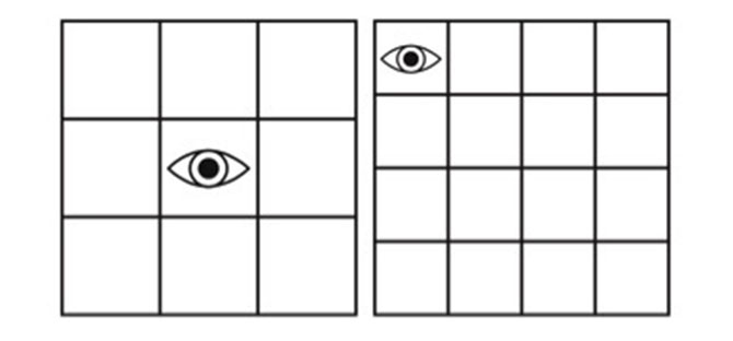
- This tip is for arrays of images: if you have a series of images arranged in a grid array, take a look to see whether there is a central position in the grid. If there is, that’s the one that people are most likely to look at first. If there isn’t an exact central position, then they are most likely to look at the top left position first.

- If you are trying to depict a product that you want people to desire, show a photo of someone touching it (picking it up, holding it or interacting with it in some way that obliges them to touch it). Research has shown that people are more likely to want something if they see someone else touching it; an effect known as Mimetic Desire.
Make images easy for the brain to process

Whatever information you are trying to convey with a design, think about ways to portray it more simply than people might expect. Research shows that our minds confuse things that are simple with things that feel familiar. We have a bias towards liking familiar things, but especially when we recognise something familiar in an unfamiliar place. For example, you may not be especially delighted if you see your next door neighbour outside your home, but if you suddenly bump into them somewhere you wouldn’t expect to see them, it can bring a smile to your face. Similarly, if you encounter something that is unexpectedly simple, it can create the same pleasurable effect.
This is why infographics are so popular: they take often hard-to-understand information and illustrate it simply. Think about ways you can convey the most information with the least amount of visual detail, and you are more likely to create a design people will enjoy looking at.
Neuro Design thinking can offer a new way to consider how we see images, and reveal patterns that we aren’t consciously aware of. For marketers, it can help unlock fresh insights into many challenges, from making your designs more noticeable and engaging, to making them more effective at communicating the qualities of your brand.
Darren Bridger’s book is available, here. Save 20% with the discount code OMKGMA20 here:
Read also:
Get personal: making the online user experience as unique as the customer